
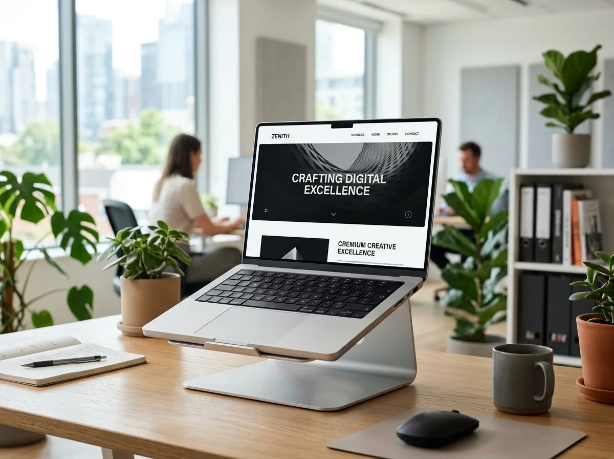
Your website is often the first serious interaction a potential customer has with your business.
Before someone calls you, sends an enquiry, visits your office or speaks with your sales team, they may already have visited your website.
And in many cases, they're making a decision within seconds.
Does this business look credible?
Can they actually solve my problem?
Is this service right for me?
Should I continue exploring or leave?
This is why website design is about much more than colours, fonts and animations.
A good business website needs to combine visual design, user experience, messaging, performance, trust and conversion strategy.
A website can look visually impressive and still lose customers.
It may have beautiful animations but confusing navigation.
It may have excellent graphics but unclear messaging.
It may rank well on Google but fail to convert visitors.
It may even look perfect on desktop while creating a frustrating experience on mobile.
The real purpose of website design isn't simply to make a website look good.
It's to make it easy for the right visitor to understand your business, trust you and take the next step.
Here are 10 common website design mistakes that can cost your business customers.
1. Your Website Doesn't Explain What You Do Quickly
One of the first things visitors want to know is:
"What does this company actually do?"
If your homepage requires visitors to scroll through multiple sections before they understand your offer, you have a messaging problem.
For example, a headline such as:
"Creating Experiences That Inspire Tomorrow"
may look creative.
But it doesn't tell the visitor:
- What you sell
- Who you help
- What problem you solve
- Why they should care
Compare that with a more direct message:
"Performance Marketing for Businesses Ready to Generate More Qualified Leads."
The second statement immediately provides context.
What to do
Your hero section should communicate the core value proposition quickly.
A useful structure is:
What you do + who you help + primary outcome + CTA
The visitor shouldn't have to solve a puzzle to understand your business.
2. Your Website Is Designed for You, Not Your Customer
Business owners naturally want their website to reflect their brand.
That's important.
But the website ultimately exists for the customer.
A common mistake is organizing the website around what the company wants to say rather than what the customer wants to know.
For example, a business might place:
About Us → Our History → Our Philosophy → Our Team
before explaining the actual service.
But a potential customer may want to know:
Can you solve my problem?
How does your service work?
Have you done this before?
How much does it cost?
How do I contact you?
Your website structure should reflect the customer's journey.
What to do
Think about the questions a visitor is likely to have at each stage.
Then build the page structure around those questions.
A useful journey can look like:
Problem → Solution → Benefits → Proof → Process → FAQs → CTA
This makes the website more customer-focused.
3. Your Navigation Is Confusing
Navigation should help visitors find information, not make them think about where information might be.
A complicated navigation menu can create unnecessary friction.
For example, a website may have:
- Solutions
- Capabilities
- Expertise
- Resources
- Insights
- Offerings
- Discover
These labels may sound sophisticated, but visitors may not immediately understand what they mean.
For a service business, straightforward navigation is often easier to use:
- Home
- About
- Services
- Work
- Blog
- Contact
The exact structure depends on the business, but clarity should always be a priority.
What to do
Review your navigation and ask:
Can a new visitor understand where each menu item will take them?
If not, simplify it.
4. Your Website Is Too Slow
Design doesn't matter much if visitors don't wait long enough to see it.
Large images, excessive animations, unnecessary scripts, poorly optimized plugins and heavy third-party resources can negatively affect website performance.
This can be particularly problematic on mobile connections.
A slow website can affect:
- User experience
- Engagement
- Conversion rate
- Search performance
- Paid advertising efficiency
If you're spending money to bring visitors to your website, you don't want them leaving because the page takes too long to load.
What to do
Review:
- Image sizes
- Image formats
- JavaScript
- CSS
- Plugins
- Fonts
- Third-party scripts
- Hosting performance
- Caching
Use tools such as PageSpeed Insights and other performance diagnostics to identify bottlenecks.
Performance optimization isn't just a technical task.
It's part of the customer experience.
5. Your Mobile Website Isn't Good Enough
A website that looks excellent on a large desktop monitor can still provide a poor mobile experience.
And this is a serious problem because many users discover businesses through smartphones.
Common mobile design problems include:
- Text that's too small
- Buttons that are difficult to tap
- Horizontal scrolling
- Overlapping elements
- Huge images
- Broken layouts
- Slow loading
- Difficult navigation
- Pop-ups covering important content
If the mobile experience feels frustrating, visitors may leave before they ever understand your offer.
What to do
Don't simply "shrink" your desktop design for mobile.
Design the mobile experience intentionally.
Check:
- Typography
- Spacing
- Buttons
- Navigation
- Images
- Forms
- Section order
- CTA placement
A responsive website should feel natural on every major screen size.
6. Your Website Has Too Many Things Competing for Attention
More isn't always better.
Some websites try to include:
- Multiple animations
- Videos
- Pop-ups
- Sliders
- Floating buttons
- Moving text
- Large graphics
- Multiple CTAs
- Decorative elements
The result can be visually busy.
Good design creates hierarchy.
Visitors should immediately understand:
What's most important?
What should I read next?
Where should I click?
What action should I take?
What to do
Use visual hierarchy deliberately.
Your design should guide attention through:
Headline → Supporting message → Proof → Benefits → CTA
Not every element needs to demand attention.
Sometimes the strongest design decision is removing something.
7. Your CTAs Are Weak or Hard to Find
Imagine a visitor reads your entire service page and decides:
"This looks like the right company."
Then what?
If your CTA is buried at the bottom or simply says:
Submit
you may lose the opportunity.
Your CTA should make the next step obvious.
Depending on your business, it could be:
- Book a Consultation
- Request a Proposal
- Get a Quote
- Start Your Project
- Get a Free Audit
- Talk to Our Team
- Request a Demo
You can also use different CTAs for different buying stages.
What to do
Make sure important pages have a clear primary action.
The CTA should be:
- Visible
- Specific
- Relevant
- Easy to understand
- Easy to complete
A visitor shouldn't have to search for a way to contact you.
8. Your Website Doesn't Show Enough Proof
Your website can make impressive claims.
But customers want evidence.
If you say:
"We deliver exceptional results."
the visitor may ask:
"Can you show me?"
This is where trust signals become important.
Use:
- Client testimonials
- Case studies
- Project screenshots
- Reviews
- Client logos
- Before-and-after examples
- Results
- Certifications
- Industry experience
For example, instead of simply saying:
"We've worked with many businesses."
show relevant projects.
Instead of:
"We generate results."
show the context behind those results where possible.
What to do
Build proof into the website rather than hiding everything on a separate page.
Relevant proof should appear near the claims it supports.
Good design doesn't only communicate what you can do. It helps prove it.
9. Your Website Uses Too Much Generic Stock Content
Stock imagery isn't automatically bad.
The problem is using generic images that have nothing to do with your actual business.
For example, a technology company showing a random team sitting around a laptop doesn't necessarily communicate anything meaningful.
Similarly, a digital agency using generic office images may make the website look interchangeable with hundreds of competitors.
Your visual content should support your positioning.
What to do
Where possible, use:
- Actual projects
- Product screenshots
- Original photography
- Team photographs
- Real client work
- Custom illustrations
- Brand-specific graphics
- Relevant UI mockups
If you have impressive work, show it.
Your portfolio can often be more persuasive than generic decorative imagery.
10. Your Website Doesn't Have a Clear Conversion Journey
This is perhaps the biggest problem.
A website isn't just a collection of pages.
It should guide visitors somewhere.
Imagine someone arrives through Google.
They read your service page.
Then what?
If there is no logical next step, the journey ends.
A strong website creates a path:
Search → Landing Page → Value Proposition → Benefits → Proof → FAQs → CTA → Enquiry
Different visitors may take different paths, but the important actions should be easy to find.
What to do
Map your main conversion journeys.
For example:
Google Search → SEO Service Page → Case Study → Consultation
or:
Google Ad → Landing Page → Offer → Form → Sales Call
or:
Instagram → Homepage → Portfolio → Service → Enquiry
Your website should support these journeys rather than forcing every visitor through the same path.
How Poor Website Design Can Affect Marketing
Website design doesn't operate separately from marketing.
Your website is where many marketing activities ultimately send people.
For example:
SEO → Website
Google Ads → Website
Meta Ads → Website
Social Media → Website
Email → Website
If the website isn't ready to convert that traffic, your marketing performance can suffer.
Imagine spending ₹30,000 on advertising and generating 300 relevant visitors.
If the website creates a poor experience, many of those visitors may leave without taking action.
The problem may not be the advertising.
It may be the destination.
This is why website design, performance marketing and conversion optimization should be considered together.
How to Know If Your Website Needs a Redesign
Not every website needs a complete redesign.
Sometimes a few strategic improvements can make a significant difference.
Consider a redesign or optimization project if:
- Your website looks outdated
- It isn't mobile-friendly
- Visitors can't understand your offer
- Your navigation is confusing
- Pages load slowly
- Your website doesn't generate enquiries
- Your branding has changed
- Your services have changed
- Your website is difficult to update
- Your competitors have significantly stronger digital experiences
- Your website isn't supporting your marketing campaigns
The goal shouldn't be:
"Let's make the website look newer."
The goal should be:
"Let's make the website work better for the business."
Website Design Checklist for Businesses
Before launching or redesigning your website, review these areas.
Messaging
- Is it immediately clear what the business does?
- Is the target audience clear?
- Is the main value proposition easy to understand?
- Are business outcomes communicated?
User Experience
- Is navigation simple?
- Can visitors find important information quickly?
- Is the page structure logical?
- Are CTAs easy to find?
Mobile
- Does the website work properly on smartphones?
- Are buttons easy to tap?
- Is the text readable?
- Are forms easy to complete?
Performance
- Are images optimized?
- Are unnecessary scripts removed?
- Does the website load efficiently?
- Have performance issues been tested?
Trust
- Are testimonials visible?
- Are case studies available?
- Is your portfolio easy to access?
- Do you show evidence of your experience?
Conversion
- Does every major page have a clear next step?
- Are forms simple?
- Are CTAs specific?
- Is the customer journey easy to understand?
How BrandScout Approaches Website Design
At BrandScout, website design isn't treated as simply choosing colours, fonts and layouts.
We look at the website as part of the overall brand and customer acquisition system.
That means considering:
- Brand positioning
- Target audience
- User experience
- Website structure
- Visual identity
- Content
- SEO
- Conversion paths
- Performance
- Mobile experience
Depending on the project, we work with platforms such as WordPress and Shopify to create websites aligned with the business's requirements.
The objective is to create a website that looks professional while also being:
Clear. Fast. Responsive. Credible. Easy to navigate. Built for action.
Because your website should not simply tell people that your business exists.
It should help them understand why your business is worth choosing.
Final Thoughts: Good Website Design Is About More Than Looks
A beautiful website can attract attention.
But a successful business website needs to do much more.
It needs to communicate clearly.
It needs to guide visitors.
It needs to build trust.
It needs to work on mobile.
It needs to load efficiently.
And most importantly, it needs to make it easy for the right visitors to take action.
If your website isn't generating the results you expect, don't immediately assume you need more traffic.
Start by looking at the experience you're giving the visitors you already have.
Ask:
Can they understand our offer?
Can they find what they need?
Do they trust us?
Can they easily contact us?
Does the website give them a reason to take action?
When these elements work together, website design becomes more than visual presentation.
It becomes a business growth tool.
Frequently Asked Questions
What are the most common website design mistakes?
Common mistakes include unclear messaging, confusing navigation, slow loading speeds, poor mobile responsiveness, weak CTAs, lack of trust signals, excessive design elements, generic imagery and an unclear conversion journey.
How does website design affect business sales?
Website design can influence how easily visitors understand your offer, navigate your website, trust your business and take action. A confusing or poorly optimized experience can create friction during the buying process.
Does a beautiful website automatically generate more leads?
No. Visual design is only one part of a high-performing website. Messaging, user experience, search intent, trust, performance and conversion strategy also influence lead generation.
How important is mobile website design?
Mobile design is extremely important because many users access websites through smartphones. A website should provide a clear, responsive and easy-to-use experience across different screen sizes.
How can I improve my website conversion rate?
Start by reviewing your value proposition, CTAs, service pages, landing pages, forms, trust signals and overall customer journey. Analytics and user behaviour data can help identify where visitors are dropping off.
Should I redesign my entire website?
Not necessarily. Some websites can benefit from targeted improvements to messaging, navigation, mobile responsiveness, performance or conversion elements. A full redesign makes more sense when the underlying structure or positioning needs significant changes.
How often should a business redesign its website?
There is no universal redesign schedule. Businesses should review their website regularly and consider redesigning when the site no longer supports the brand, customer expectations, technology, marketing strategy or business goals.
What should a business website homepage include?
A homepage will vary by business, but commonly includes a clear value proposition, primary CTA, key services, benefits, trust signals, relevant work or case studies, process information and supporting content.
Is website speed important for SEO?
Website performance is one component of the broader user experience and search ecosystem. Regardless of SEO, improving speed can help create a better experience for visitors and reduce unnecessary friction.
Should I use animations on my website?
Animations can improve visual storytelling when used carefully. Excessive or poorly implemented animations can distract visitors or affect performance. The purpose should be to improve the experience rather than add movement simply for decoration.
Does BrandScout provide website redesign services?
Yes. BrandScout works on website design and redesign projects with a focus on brand presentation, user experience, responsive design, conversion opportunities and the broader business objective.
Which platform is better for a business website: WordPress or Shopify?
It depends on the website's purpose. WordPress can provide flexibility for business websites, content platforms and custom requirements, while Shopify is specifically focused on ecommerce. The right platform should be selected based on functionality, business goals and long-term requirements.


